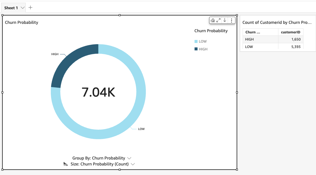
AWS QuickSight provides an intuitive platform for visualizing churn prediction results generated by SageMaker Canvas. By building custom dashboards, business users can gain insights into churn likelihood, identify patterns, and make data-driven decisions to reduce churn. This guide covers the integration of QuickSight with SageMaker outputs, data transformation steps, and best practices for creating impactful dashboards.

Integrating QuickSight with SageMaker Outputs
Step 1: Exporting SageMaker Canvas Outputs to S3
After SageMaker Canvas completes model training and prediction, the results can be exported to an S3 bucket. Ensure that the bucket is configured to allow QuickSight to access this data.
Step 2: Setting Up Permissions for QuickSight
To enable QuickSight to access data in S3, you need to configure permissions:
- QuickSight Access to S3: Go to the QuickSight console, navigate to Manage QuickSight, and add the S3 bucket containing the SageMaker outputs.
- IAM Role: Create an IAM role with access to both SageMaker and the S3 bucket. Attach this role to QuickSight.
Step 3: Creating a QuickSight Data Set
In QuickSight, create a new data set by connecting to the S3 bucket where the SageMaker outputs are stored. Select the appropriate file format (CSV or JSON) and confirm that QuickSight recognizes the schema correctly.
Data Transformation and Analysis
To ensure the data is easy to consume, structure it in a way that highlights the key metrics for churn prediction.
Structuring the Data
- Prediction Results: Include fields such as Customer ID, Predicted Churn Probability, Predicted Outcome, and Key Features Contributing to Churn.
- Metrics: Prepare metrics such as average churn probability, churn rates per customer segment, and risk scores.
Data Transformation in QuickSight
- Calculated Fields: Use QuickSight’s calculated fields to derive metrics like churn likelihood percentages or risk scores based on model outputs.
- Aggregation: Aggregate data by customer segments, regions, or product types to provide deeper insights into specific groups.
- Filtering and Sorting: Apply filters and sorting to focus on high-risk customers or those requiring immediate attention.
Example of a Calculated Field for Churn Probability
'''
IF(predicted_churn_probability > 0.7, "High Risk", "Low Risk")
'''
This calculated field categorizes customers based on their churn probability, allowing for easy identification of high-risk individuals.
Creating Dashboards
A well-designed QuickSight dashboard can display critical churn metrics, trends, and actionable insights.
Step 1: Design Key Visualizations
Some suggested visualizations for a churn prediction dashboard:
- Heat Maps: Show churn likelihood across different regions or customer segments.
- Bar Charts: Compare churn probability distributions across different customer demographics.
- Scatter Plots: Visualize relationships between churn likelihood and key features (e.g., tenure, usage frequency).
- Tables: List high-risk customers, showing their churn probability and contributing factors.
Step 2: Building the Dashboard
- Layout and Structure: Arrange visualizations in a logical flow, with key metrics and high-risk customer lists at the top.
- Interactive Filters: Add filters to allow users to view churn predictions for specific regions, segments, or time periods.
- Conditional Formatting: Use color coding to highlight customers at high risk of churn, making it easier for users to identify them.
Step 3: Customizing for Business Insights
Include textual annotations or KPIs that provide insights, such as the number of high-risk customers, top features contributing to churn, and recommendations for action.
Business Impact
Visualizing churn predictions in QuickSight can help drive strategic decisions that reduce churn and improve customer retention.
Leveraging Insights for Actionable Decisions
- Prioritize Retention Efforts: Focus retention efforts on high-risk customers as indicated by the churn probability.
- Understand Churn Drivers: Use feature importance metrics to identify factors influencing churn, such as contract length or service usage.
- Segment Analysis: Identify customer segments with higher churn rates and tailor retention strategies accordingly.
Example Use Cases
- Customer Success Teams: Provide customer success teams with a list of high-risk accounts for proactive outreach.
- Marketing Campaigns: Use insights to design targeted marketing campaigns aimed at reducing churn in specific segments.
Advanced Customization
Adding Predictive Analytics
QuickSight can enhance dashboards with predictive analytics by leveraging forecast features for time series data:
- Forecasting Trends: Predict future churn rates based on historical patterns, allowing teams to anticipate trends.
- Anomaly Detection: Identify unusual spikes in churn probability to investigate potential issues or trigger preventive measures.
By integrating AWS QuickSight with SageMaker Canvas, businesses can create impactful dashboards that visualize churn predictions and drive actionable insights. From structuring data effectively to customizing dashboards for advanced analytics, this setup enables data-driven decisions aimed at reducing churn. Advanced features like predictive analytics and embedding options further enhance the potential for QuickSight dashboards to deliver business value.
