Objective
This article explains how to evaluate the performance of a SageMaker-trained model using standard metrics for binary classification. We will compute metrics such as accuracy, F1 score, and AUC, along with generating visualizations like a confusion matrix and ROC curve.
Metrics for Binary Classification
To assess the performance of a binary classification model, the following metrics are commonly used:
- Accuracy: Proportion of correctly predicted instances out of the total instances.
- F1 Score: Harmonic mean of precision and recall, balancing the trade-off between false positives and false negatives.
- AUC (Area Under Curve): Measures the model's ability to distinguish between classes, calculated from the ROC curve.
Computing Metrics Using Python
We use the sklearn library to compute the confusion matrix, ROC curve, and AUC.
Code Example
from sklearn.metrics import (
    accuracy_score, f1_score, confusion_matrix, roc_curve, auc
)
import numpy as np
import seaborn as sns
import matplotlib.pyplot as plt

# Ground truth labels (y_test) and predicted probabilities (y_pred_prob)
y_pred = (np.array(y_pred_prob) > 0.5).astype(int)

# Compute confusion matrix
cm = confusion_matrix(y_test, y_pred)
print("Confusion Matrix:\n", cm)

# Compute accuracy and F1 score
accuracy = accuracy_score(y_test, y_pred)
f1 = f1_score(y_test, y_pred)
print(f"Accuracy: {accuracy:.2f}")
print(f"F1 Score: {f1:.2f}")

# Compute ROC curve and AUC
fpr, tpr, _ = roc_curve(y_test, y_pred_prob)
roc_auc = auc(fpr, tpr)
print(f"AUC: {roc_auc:.2f}")
Interpreting the Confusion Matrix and ROC Curve
Confusion Matrix
The confusion matrix provides a summary of prediction results:
- True Positives (TP): Correctly predicted positive instances.
- True Negatives (TN): Correctly predicted negative instances.
- False Positives (FP): Incorrectly predicted positive instances.
- False Negatives (FN): Incorrectly predicted negative instances.
Example Confusion Matrix:
[[884, 152],
[154, 219]]
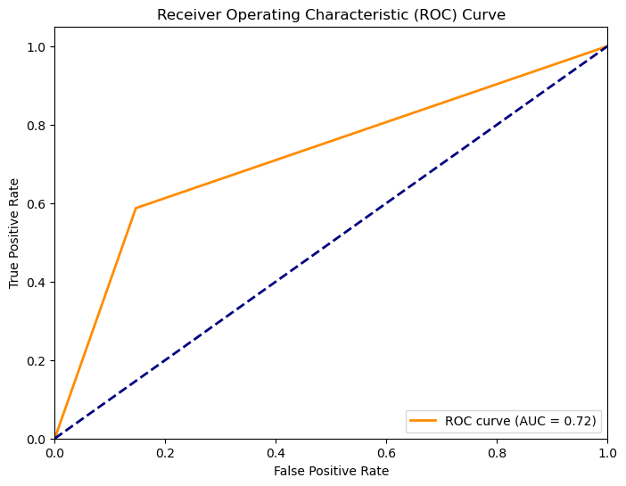
ROC Curve and AUC
The ROC curve plots the True Positive Rate (TPR) against the False Positive Rate (FPR) at various thresholds. The AUC quantifies the overall ability of the model to distinguish between classes, where 1.0 represents a perfect model and 0.5 represents a random guess.
Visualizing the Results
Confusion Matrix Heatmap
Code Example:
sns.heatmap(cm, annot=True, fmt='d', cmap='Blues',
            xticklabels=['No Churn', 'Churn'],
            yticklabels=['No Churn', 'Churn'])
plt.title('Confusion Matrix')
plt.ylabel('True Label')
plt.xlabel('Predicted Label')
plt.show()
ROC Curve
Code Example:
plt.figure(figsize=(8, 6))
plt.plot(fpr, tpr, color='darkorange', lw=2, label=f'ROC curve (AUC = {roc_auc:.2f})')
plt.plot([0, 1], [0, 1], color='navy', lw=2, linestyle='--')
plt.xlabel('False Positive Rate')
plt.ylabel('True Positive Rate')
plt.title('Receiver Operating Characteristic (ROC) Curve')
plt.legend(loc="lower right")
plt.show()
Example Output
Confusion Matrix Heatmap

ROC Curve

Evaluating model performance is critical for understanding its effectiveness and identifying areas for improvement. By using metrics like accuracy, F1 score, and AUC, along with visualizations, we can comprehensively assess how well the SageMaker-trained model performs on test data.

-and.webp)